A Wild Sheep Chase

A Wild Sheep ChaseOn the recommendation of a trusted friend I recently read ‘A wild Sheep Chase ‘ by Haruki Murakami. It was a slightly trippy but wonderfully written book (even in translation). I particularly enjoyed a passage describing the mysterious Boss’ house and, as it’s loosely architectural, I thought I would like to share it. The passage is taken from the chapter titled ‘Wherefore the Worm Universe’ and may resonate with those who have suffered a compromise too far.

Having concluded my viewing of the grounds, I turned straight ahead and found myself facing a massive, towering structure.

It was—how shall I put it?—a painfully solitary building. Let me explain. Say we have a concept. It goes without saying that there will be slight exceptions to that norm. Now, over time these exceptions spread like stains until finally they form a separate concept. To which other exceptions crop up. It was that kind of building, some ancient life-form that had evolved blindly, toward who knows what end.

In its first incarnation, it seems to have been a Meiji-era Western-style manor. A high-ceilinged portico offered entrance to a two-story cream-colored house. The windows tall and double-hung in the true old style, the paint redone time and again. The roof was, as expected, copper-shingled, and the rain gutters as solid as a Roman aqueduct. A fine house in itself, exuding a period charm. But then some joker of an architect came along to attach another wing of the same style and color scheme onto the right side of the original structure. The intention wasn’t bad, but the effect was unpalatable. Like serving sherbet and broccoli on the same silver platter.

This unhappy combination stood untouched for several decades until someone added a stone tower off to one side. At the pinnacle of this tower was affixed a decorative lightning rod. A mistake. Lightning was meant to strike the building and burn it down.
A new paradigm?

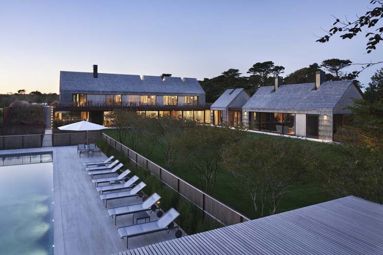
I get this fantastic daily e-mail from contemporist which I read/look at the pictures first thing every day. It’s always an inspiring start.  Today I saw this beautiful house by Bates Masi Architects and immediately envisaged it housing not one family but four, maybe even five.Bates Masi ArchitectsI often get this feeling when I see these large- very, very large family homes. So much of them must sit sadly empty for the majority of the time. I can really imagine these places as multiple houses- I would happily share that swimming pool.

ASA Forum 2015

badgeHere at renga design we love a little bit of cpd whether it be listening to a podcast on design, taking a photo walk round a new part of the city or just watching Grand Designs with a cup of tea. At the beginning of May I attended an event run by the Association of Siamese Architects being held at a massive expo center to the North of the city. It involved exhibitions alongside a construction show and a set of lectures spread over three days. I was only able to go for one day and watch two lectures but it was great to back in lecture theater taking notes- seriously, it was.

lecture hall

The first lecture was by South African architect Peter Rich. He had alot of interesting things to say but the thing I most enjoyed were the fantastic studies and drawings of settlements and villages. For the Alexandra Interpretation Center he carried out a meter by meter survey of a small area of the township in which Mandela had lived moving from house to house on his own asking children to hold the tape for him and really getting to know the inhabitants. I can’t find a great picture of his sketches as his website is currently down but I’ll be buying his book when it comes out.

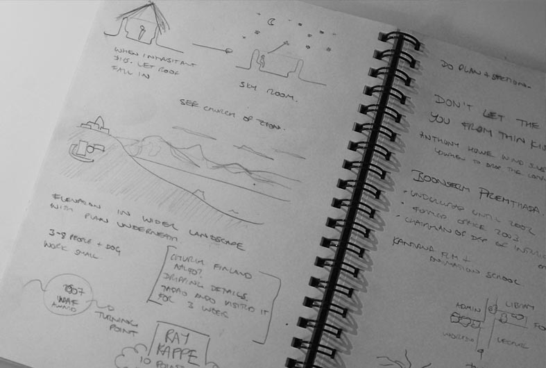
Notes

The second lecture was unfortunately and maybe also fortunately in Thai. With my mind full of the last lecture the inability to understand what was being said was actually a relief. The presentation was by Boonserm Premthada and focused primarily on Kantana film and Animation Institute. Now this was my kind of project. Made primarily from lovely wobbly, terracotta coloured, slim Thai brick. It is strident, bold and beautiful. With a clear axial plan massive undulating brick walls create a dramatic place to study. Please look at the pictures from the link above- you’ll see what I mean. Visually it was a great presentation with the images communicating the concept clearly despite having no understanding of what was being said. Maybe next year I’ll be better placed to understand a bit more and be able to talk to some of the attendees.

I was really glad I went to the ASA Forum as I came away inspired and reminded of the power of concept and a clear design process focused on carefully considered outcomes or objectives.

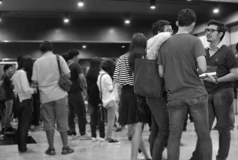
crazy kids

Maybe next year I’ll be able to talk to some people!

Need a little light in your life?

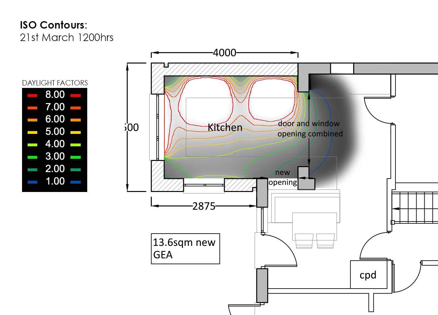
/Users/Sarah/Documents/Work/Renga/2015 Mitchell/model file.dwgI was recently asked for some daylight calculations for a small residential remodel. I used to do these manually back in university, and probably still could, but when looking for some roof-light dimensions I came across a handy free piece of software from Velux. It can be used for calculating daylight factor(plan), luminance and illuminance (3d and plan) and is available for both windows and Mac OSX. With the words of my old building engineering professor in my mind I went off in search of that lovely 5% daylight factor “bright and cheerful”.

You can draw your own model or import a model from another platform. As I was starting out I used one of their promotional videos on you tube for reference and quickly modeled up the small kitchen extension. I soon had a plan with ISO contours that I overlaid with a CAD plan which I feel is quite a good tool for making design decisions. One roof-light or two sir?

3D image- good for making comparisons of fenestration options

3D image- good for making comparisons of fenestration options

CPD Day: Sketchup LayOut

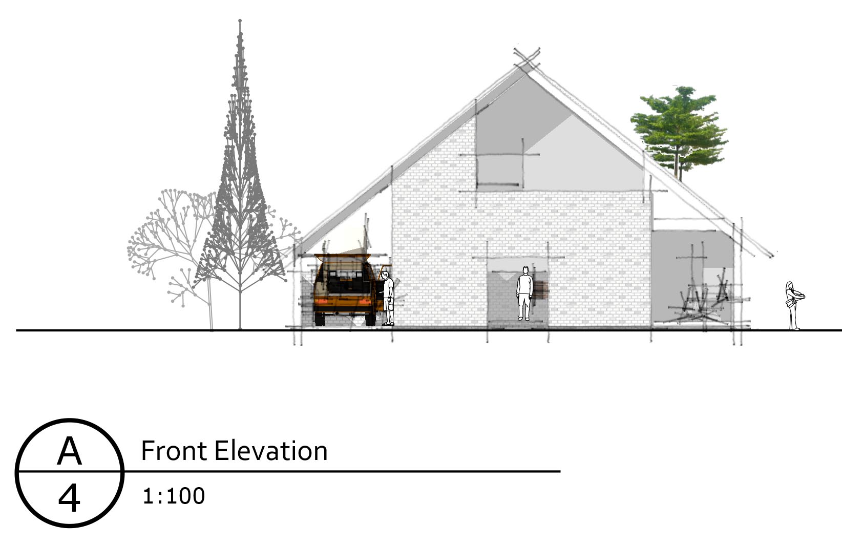
Dream House Var1After finishing a piece of work late last night while waiting for confirmation to proceed on another I decided to use today for a spot of CPD. For me this generally involves watching tutorials on Youtube and spilling food and drink onto my keyboard. I poured myself a large bowl of popcorn and sat back to learn about LayOut. LayOut comes as part of Sketchup Pro and allows you to create presentation documents from your Sketchup models. It’s very similar to working in layout space in AutoCAD.

I had a little ‘dream house ‘ project which is a 3D daydream which I used for the tutorial. It’s a house for two that focuses on a large indoor/outdoor living area.

The software is super easy to use and very flexible. A good trick for ensuring that section cuts appear with a black fill is to fill the bottom plane of the walls with a black colour. I’ll definitely be using LayOut again as Sketchup is always my ‘go to’ software for architecture and this could easily eliminate the need for using AutoCAD in the early stages of design.

The final A3 sheet is to large to insert directly into the post but please click on the link below to view.

Dream House Var1